
CBar is an awt component bean. It displays a property's value
in the control system as a moving rectangular filled area.
The size, bound, foreground, background and the font of the label
on the bar can be set like as for an awt component.
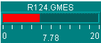
The color of the filled rectangular is the same as the foreground (Fig.2)
if the color mode property is set to CLRMOD_STATIC (default). It will
change from foreground color to yellow or red (Fig.1, Fig. 2) depending
on the property's value and warning and alarm limits when CLRMOD_ALARM is used.
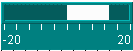
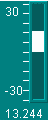
There are four label styles; the default label style is
LABEL_NONE (Fig.1). If LABEL_AXIS is used; the tick marks and display
range will appear on the CBar widget (Fig. 2). In addition to the tick marks
and display range, the property's value will also shown on the widget
if LABEL_VALUE is selected (Fig. 3). All the information including the
device and property name will on the widget when LABEL_ALL is
used (Fig.4).
The orientation of the CBar can be either VERTICAL (default) or
HORIZONTAL.
Finally the fill style can be set to FILL_FROM_EDGE (default)
(Fig. 1, Fig. 4) or FILL_FROM_CENTER (Fig. 2, Fig. 3) using the
setFillStyle (int) method.
|
|
|
|
|
|---|---|---|---|
| Fig. 1 | Fig. 2 | Fig. 3 | Fig. 4 |