ADM
CSlider Widget
CSlider is an awt component bean. It provide a convenient
means for allowing a user to control a device property's value
in a control system. The size, bound, foreground, background and
the font of the label on the slider can be set like an awt component.
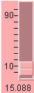
There are four label styles which can be selected, with a default of
LABEL_NONE (Fig.2). If LABEL_AXIS is used, tick marks and display
range will appear (Fig. 3). The property's value will also shown
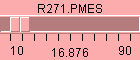
if LABEL_VALUE is selected (Fig. 4). All the information including the
device and property name will on the widget when the LABEL_ALL is
used (Fig. 5).
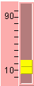
The orientation of the CSilder widget can be either VERTICAL (Fig. 1 and
Fig. 4) or HORIZONTAL (Fig. 2 and Fig. 3). The default orientation is
VERTICAL.

|
|
|
|
|---|
|
Fig. 2 | Fig. 3 |
Fig. 4 | Fig. 5 |
|---|
There are two ways to adjust the value:
(1) dragging the thumb and (2) clicking the face of the slider. When the
thumb is dragged, only a change larger than precision will be sent
to the control system. The precision value will be obtained from
control system if it is available. Otherwise the default value of
1% of the control range will be used.
When clicking on the face, the value of the
property will increase or decrease a unit increment depending upon the
clicking position. By default the unit increment is the same as the
precision, and they can be changed using either the
setPrecision(double) or setUnitIncrement(double) method. Double clicking
the thumb, a new window will pop up (Fig. 1) to allow the user to change
the unit increment value on the fly.
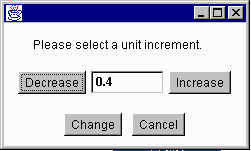
Fig. 1