ADM
CToggleButton Widget
(Since adm V0.3)
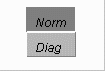
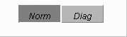
CToggleButton implements a toggle button widget with 2 mutually
exclusive buttons (Fig. 1 and Fig. 2). This widget must be connected
to a property of binary Enum type. The Enum strings will be the labels
on the button. These two mutually exclusive buttons are represented
by a raised and a etched rectangle. The etched button use to indicate
the current state. Only the raised button works like a real push button.
When the button is pressed the set action is sent to control system and
the waiting cursor will appear. If the operation succeeds, the raised button
will change to etched and etched button becomes raised. The cursor will
revert to the default cursor.
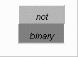
If the connected device/property is not of type of binary Enum, the "not"
and "binary" strings will be the label of the buttons (Fig. 3). No
action perform when the either button is pressed.
The toggle button can be stacked by ROW (Fig. 1) or by COLUMN (Fig. 2)
using setStacking(int) method. The default stacking is COLUMN.
|
|
|
|---|
|
Fig. 1 A ROW CToggleButton |
Fig. 2 A COLUMN CToggleButton |
Fig. 3 A disabled CToggleBotton |
|---|